Shell
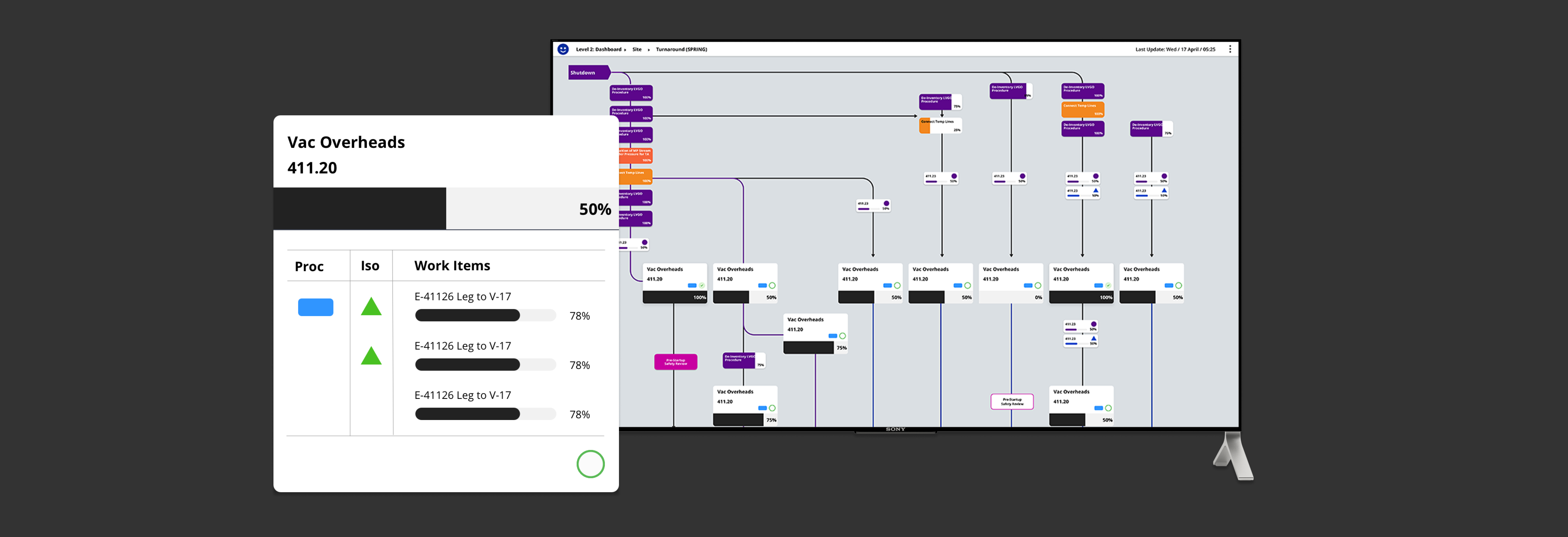
The focus for this project was to create an interactive visualization software to track progress in refineries. We completed and released two intuitive MVPs that allows teams to visualize turnaround progress using an agile approach.
*Visuals in this page are altered due to project NDA.
Role:
User Experience, User Interface, User Research
Tools:
Sketch, Invision, Zeplin
Challenges
The initial version of the order of events is made by a Planner through Visio, and printed to put on their walls for turnarounds. Since each event is made by different Planners, there is no common language and each edit is done manually, which means that there is no alignment or version control.
The main goal of this project was to create an intuitive MVP prototype allowing teams to visualize shutdown and startup procedures at refineries. Data visualization was an important factor, as well as planning out how to merge data.
Approach & Proposal:
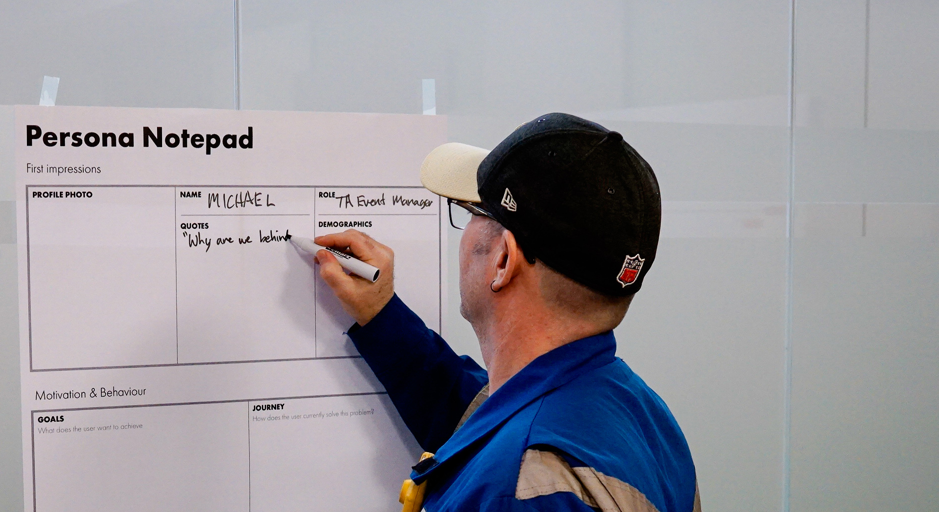
We facilitated a 5-Day Design Sprint and focused on understanding their process, and designing a digital experience that could work on a large smartboard and an iPad. Feedback from user testing was positive, insightful and helped spark new ideas that we brought into development.
Data Parsing
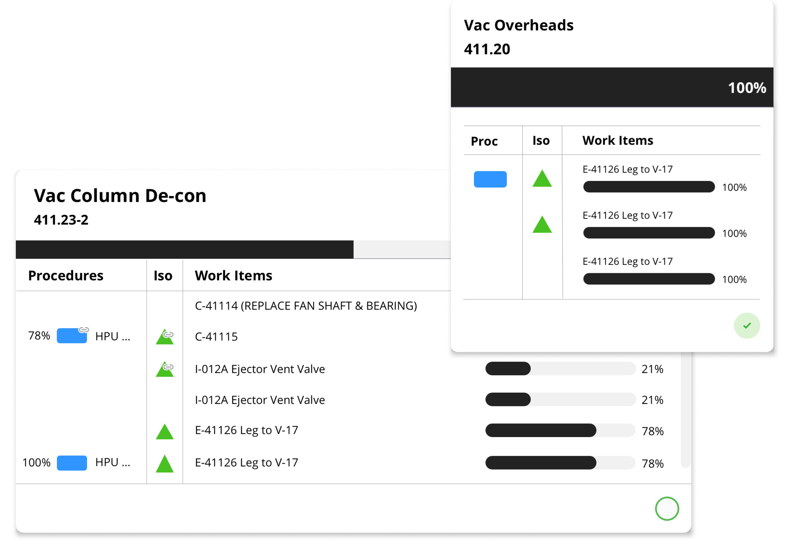
We had a main focus on refining the data visualization and data parsing. We re-defined Sites and Units and got feedback to have more information show up in the dialog.
With the client’s maintenance being involved in the usage of this software, we had to consider the specific information that is important in order to allow them to utilize it. This led to the creation of another layer of information, where the users are able to view the Activity item directly within the Work item.
User Permissions
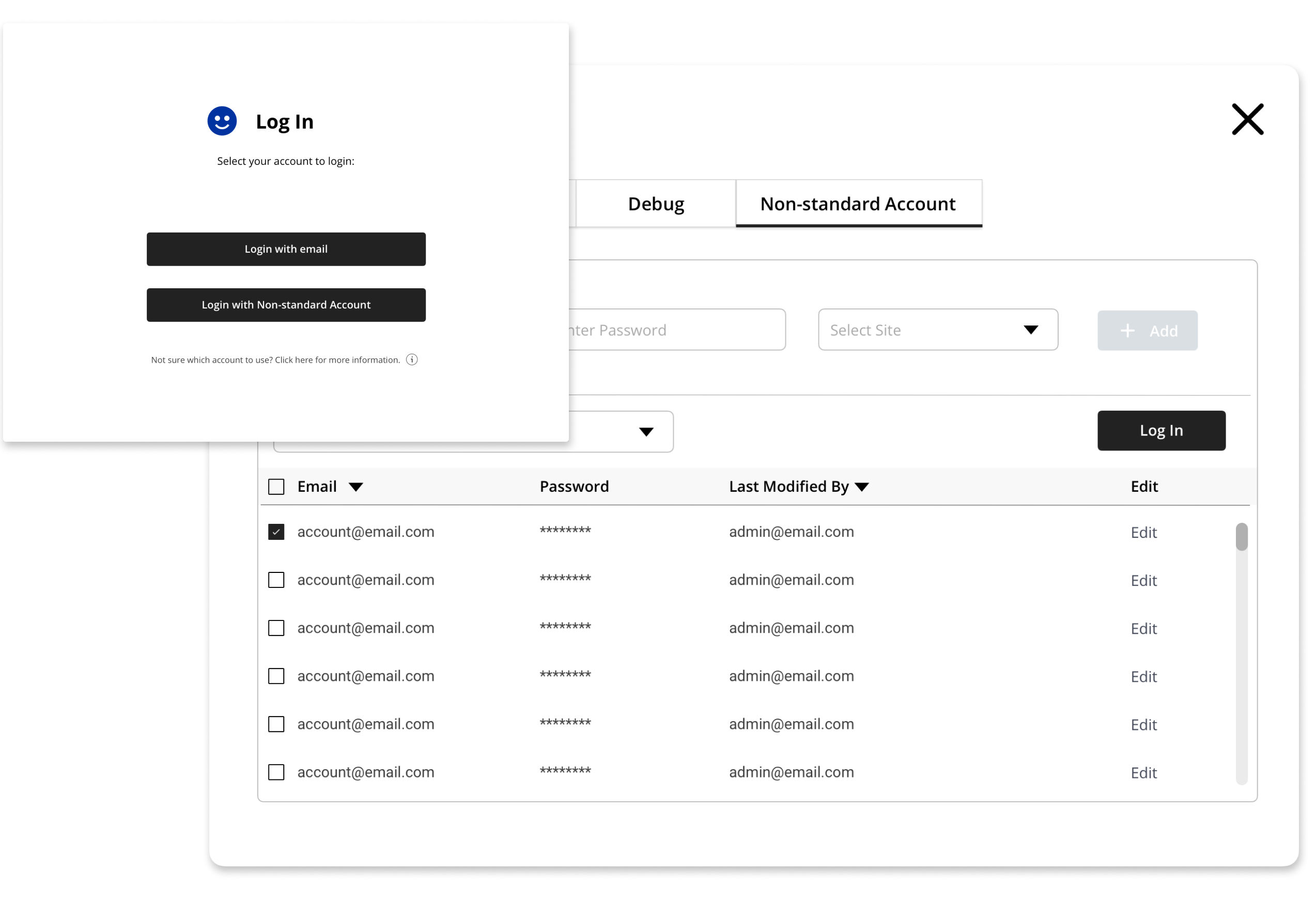
Different permission settings for the different types of users that were allowed access to the graph, which are the Default Users, Admin, and Super Admin.
Admins are able to edit user permission in the Settings tab. This means the editing of their passwords, or the ability to add/remove users as well.
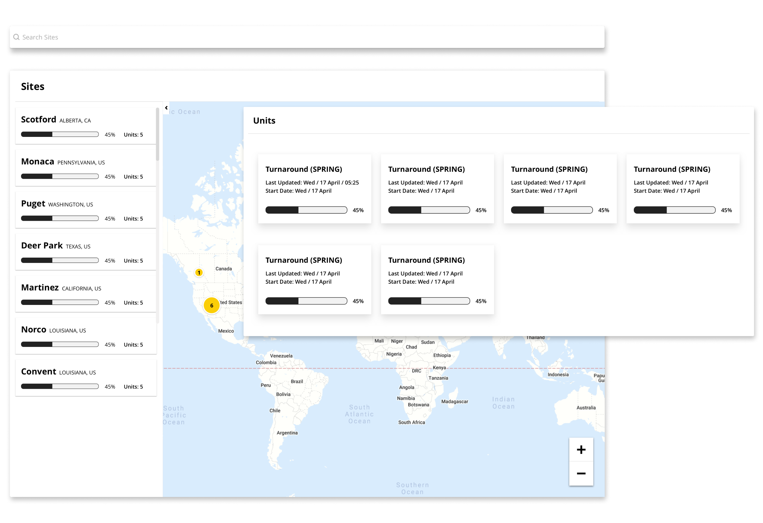
World Map
We created a world map view that leads to the list of sites and its specific units. This resulted in the gathering of the data for each site and organizing its respectful shutdown and startup procedures.
Result
This interactive visualization software will save the client countless hours of labour over previous hand-drawn versions, and will allow for better team alignment with one central source for information. This project allowed me to be get a better understanding on how to design for data, and as the lead designer on this project, I also learned the importance of validating feedback and prioritizing features that the users will need the most.